
Branding & Web Design Case Study
Haven Studio
An Interior design studio
Warm, layered & soulful interiors
*
Warm, layered & soulful interiors *
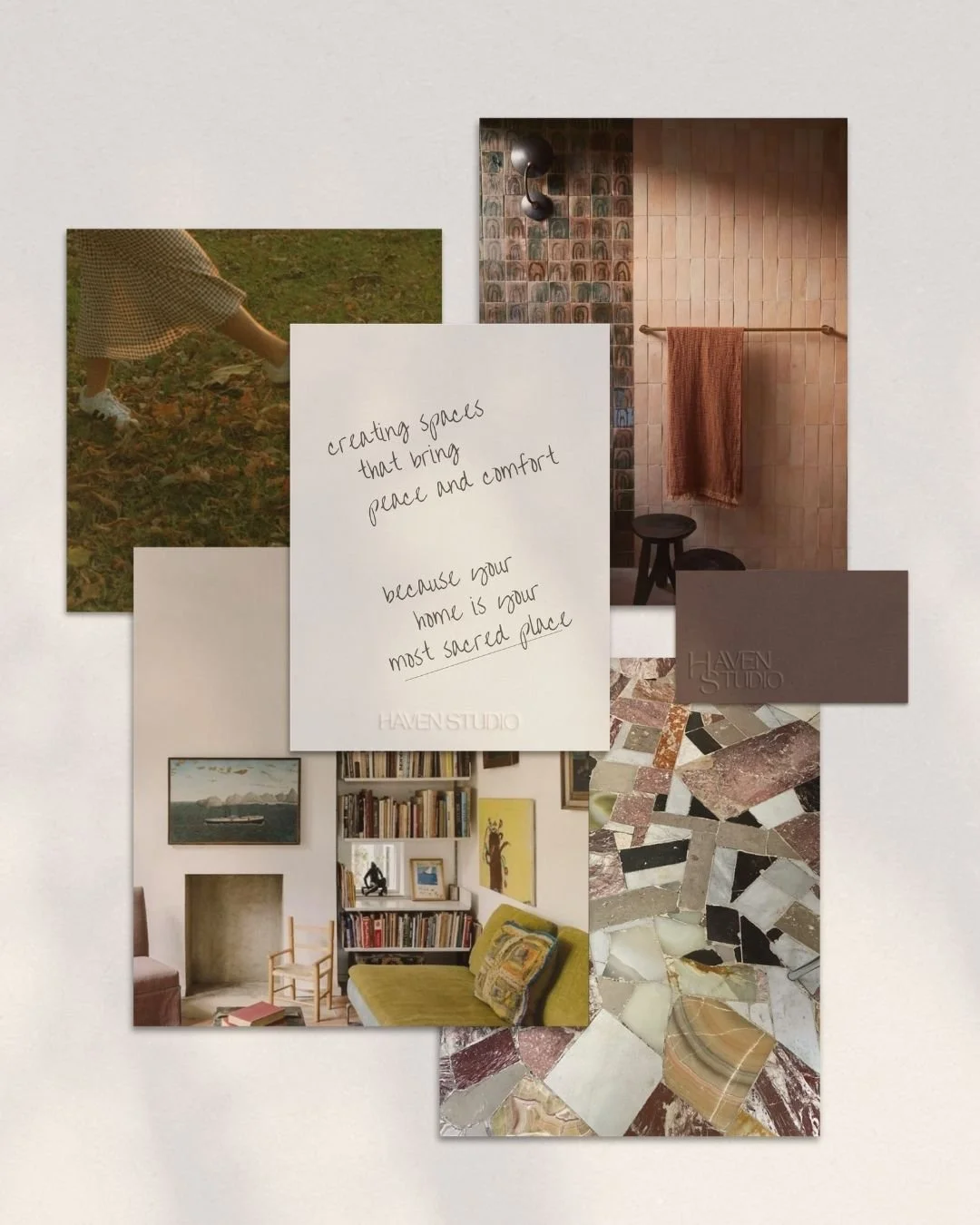
What if you came home and your house gave you a hug?
That's the entire brief I gave myself for the case study of the fictional (but all too real in my head) Haven Interior Design Studio. With a philosophy that a home is your most sacred space, Haven Studio designs modern eclectic interiors that wrap you in peace and comfort the moment you walk through the door.
Through the same methods and process I use with real clients, I developed a full visual identity for the fictitious studio; from logo, to colors, to a website concept. The mission of this fictional case study was to create a brand that felt just as warm, layered, and soul-soothing as the spaces they design, while capturing the personality and bespoke nature of the studio.
Brand identity
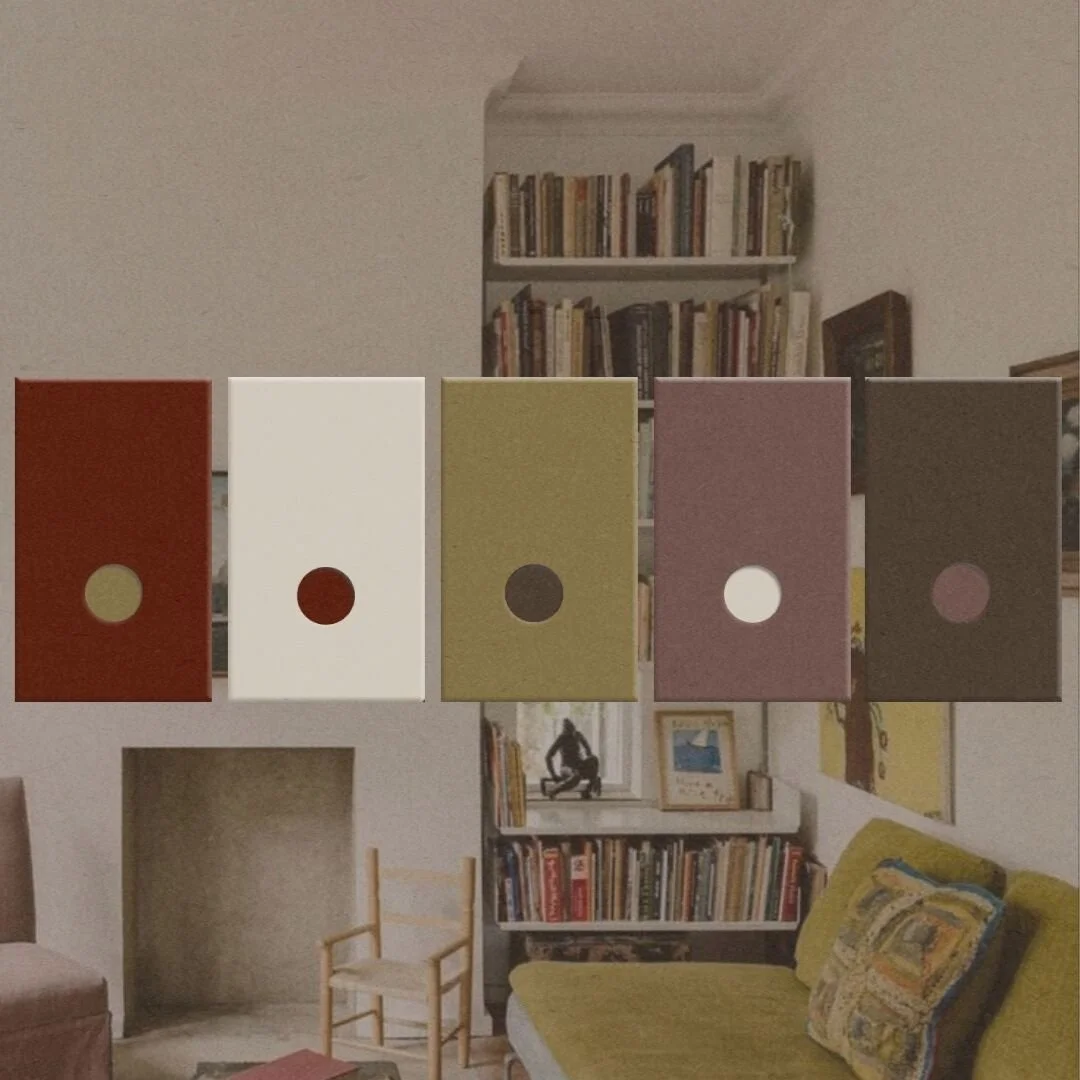
color palette
The motivation behind your design studio's color palette is as much strategy driven as it is design. The decision should stem from asking yourself this one question:
"How can each element of the visual identity immediately communicate the brand's design philosophy?"
For Haven Studio, the palette combines bold statement colors with warm neutrals that feel like a peaceful exhale. Together they say, "This home is alive and each space has it's own voice, but it will never talk over you."
the logo
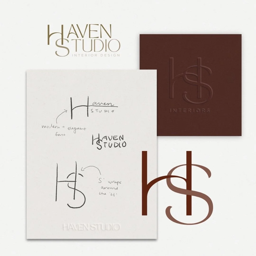
In creating the Logo for the fictional Haven Studio, the main question was this:
How can the logo communicate the studio's principle's of creating spaces that are warm, layered, and wrap your in peace the moment you open the door?
The soft modern font with a slightly whimsical edge speaks directly to the studio's bespoke, human-centered practice. The real key lies in how the 'S' wraps around the 'H', symbolizing the way each space would hold and protects its user.
the details
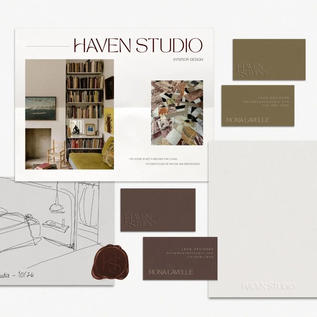
Every designer knows that a project truly comes to life in the details. It's the intricacies that turn an idea into something tangible. The same goes for creating a brand. It's the details that give it life and ensure the studio's ethos carries through every touchpoint. For Haven Studio, I created a few extra elements to really bring the identity to life:
Haven Studio flyers! To hang up around town to let the people know what they stand for.
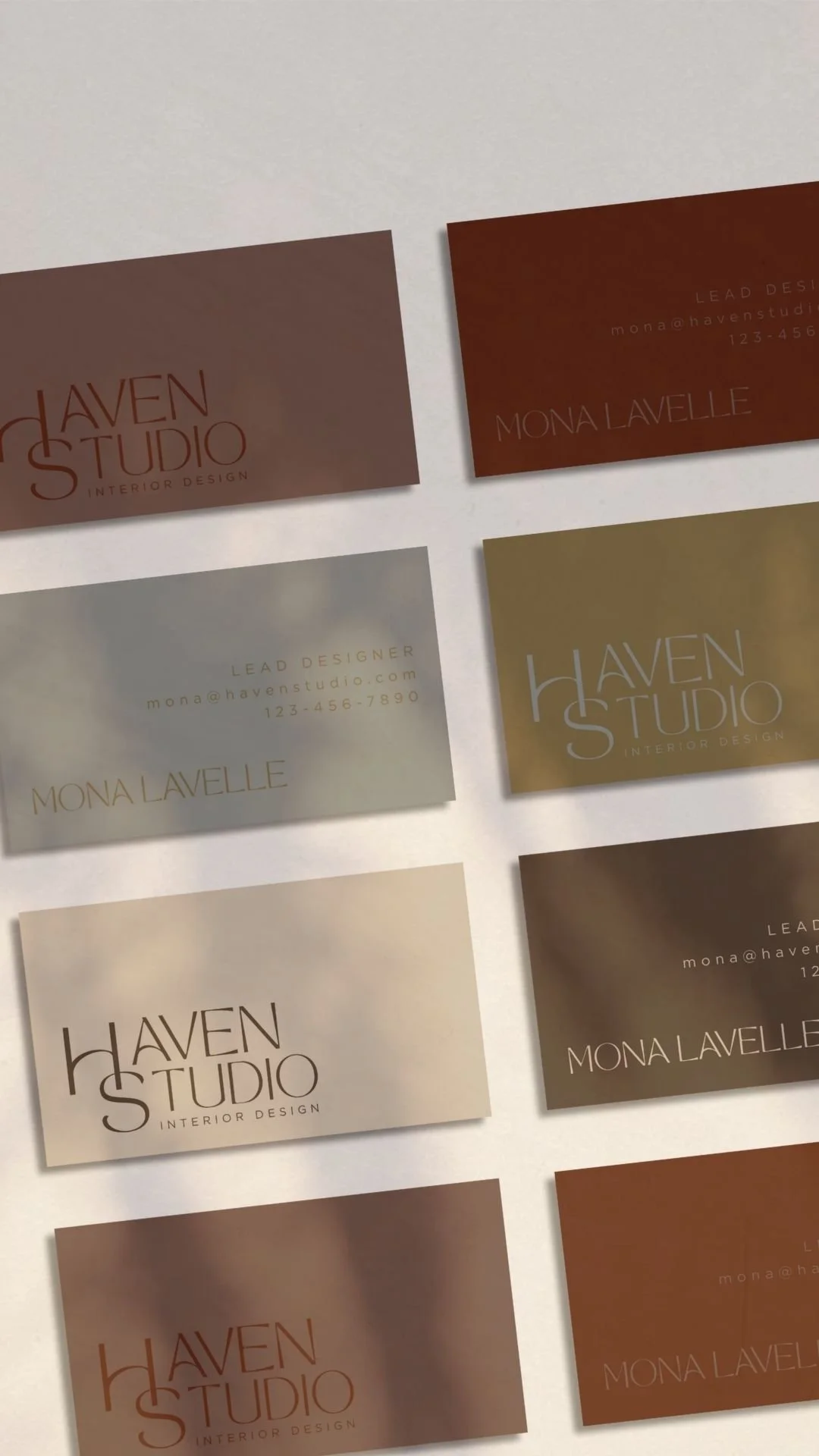
Business cards in multiple color variations, because it's more fun when each card feels special.
Custom stationary for all the notes, reminders, and sketches that take over a designer's desk.
And last but certainly not least, a custom wax seal stamp. Wouldn't it add a touch of joy if designers stamped their drawings with a wax seal?
the homepage concept
For this study, my goal was to translate Haven Studio's entire philosophy into an inviting digital doorway and create a first impression that sets the tone for their brand.
This homepage captures the textured warmth, the layered intentionality, and the soul soothing calmness that defines the spaces Haven designs. Every detail was designed to feel like stepping your into a space that was crafted with care.
now, it’s your turn.
Whether you’re an established studio looking to refine your presence or a builder starting fresh, together we’ll design a presence that supports your practice and sparks opportunity.
Ready? Start the conversation.