Your Website is your virtual tour guide
Your website has to wear a lot of hats: it’s a digital foundation, your #1 sales rep, a receptionist greeting new visitors, a translator turning design language into client-centered messages, and more. Today, I want to focus on one of its most important roles: tour guide.
When done correctly, a website should guide visitors seamlessly from curiosity to action. User flow shapes that journey. Headlines, images, buttons, and even white space aren’t just design details; they’re signposts telling visitors where to look and what to do next. When flow is clear, it tells a story, builds trust, and makes the next step feel natural. When it’s not, visitors get lost, distracted, or click away. Strong visuals and copy matter, but flow is what moves people through a page and turns interest into inquiries. Every section should have a clear purpose and guide your ideal client step by step toward working with you.
Navigation: The Map of Your Digital Space
If your website is a tour guide, the navigation bar is the map. Clear, intuitive categories help people find what they need without frustration. When navigation is obvious, users can move smoothly through your site, discover your work, and know how to take the next step. When it’s confusing, they leave.
An easy rule of thumb: keep your navigation to no more than five tabs to keep it clean and simple. For design and construction websites, these five could be:
About
Services
Portfolio
Process
Contact
These cover all the essential information potential clients need before reaching out. Other, less critical links, like blog pages or a careers page, can live in the footer along with your general site map. And don’t forget to include your logo in the nav bar and link it back to the homepage — it’s a simple but important cue for users.
For more specific tips on how to improve your websites flows, download my free checklist for design website: “The 9 Must-Haves For Every Design-Build Website”

Flow Matters as Much as Aesthetics
A beautiful lobby doesn’t matter if no one can find the elevators. Similarly, a beautiful website doesn’t matter if no one can find “Buy Now.”
As designers, we know that a building isn’t just the sum of its parts, it’s about the experience of how people move through space. A gallery with confusing circulation leaves visitors frustrated when they end up in the same room for the third time. A hospital with poor wayfinding adds stress at critical moments. Flow matters as much as aesthetics, and websites work the same way.
User flow is the digital equivalent of circulation. It’s the path users take to reach their goal, whether that’s making a purchase, booking a service, or filling out a contact form. If that flow is confusing or unpredictable, people leave. Research confirms this: usability studies show that unclear flows cause high abandonment rates, while intuitive, well-structured flows dramatically improve task success and conversions.
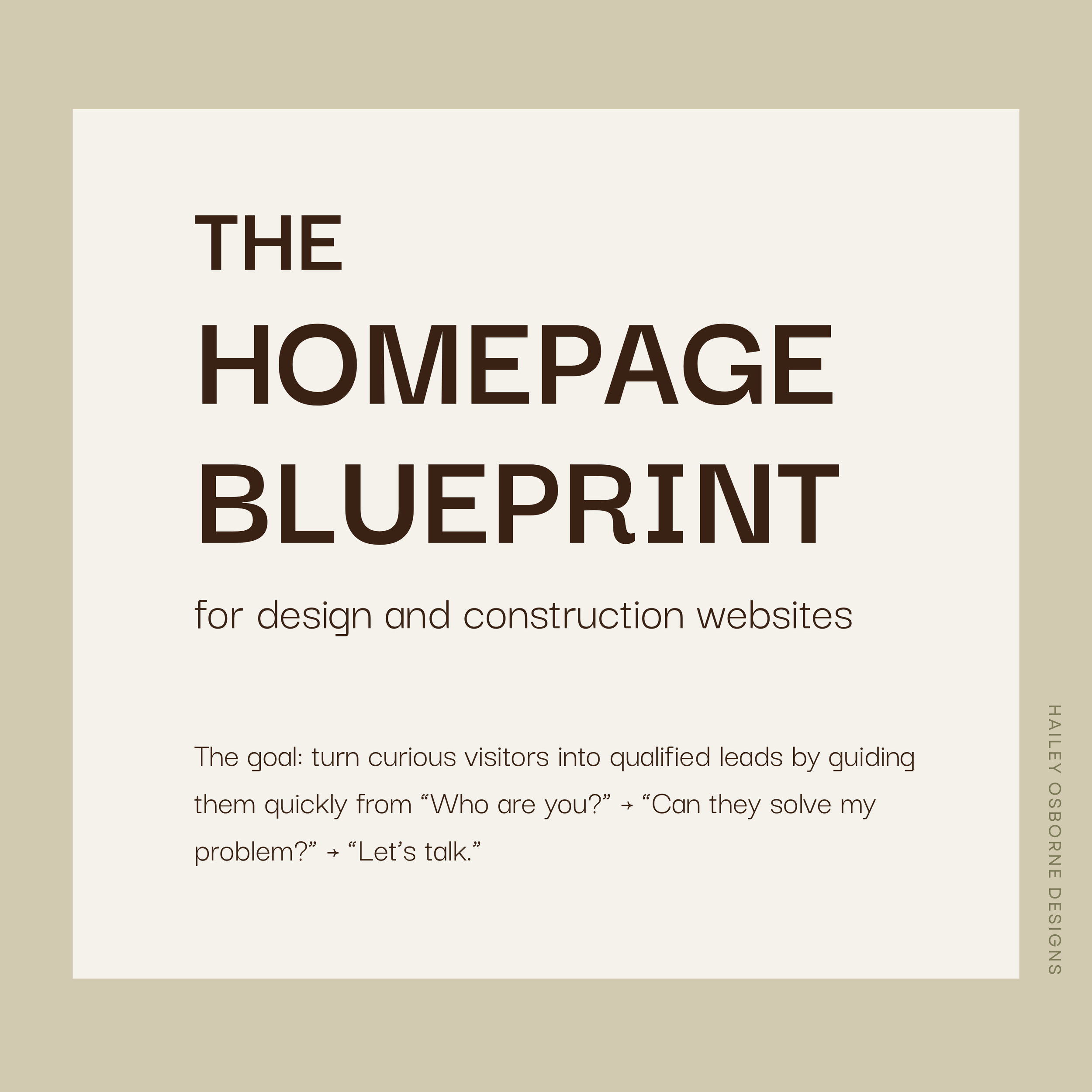
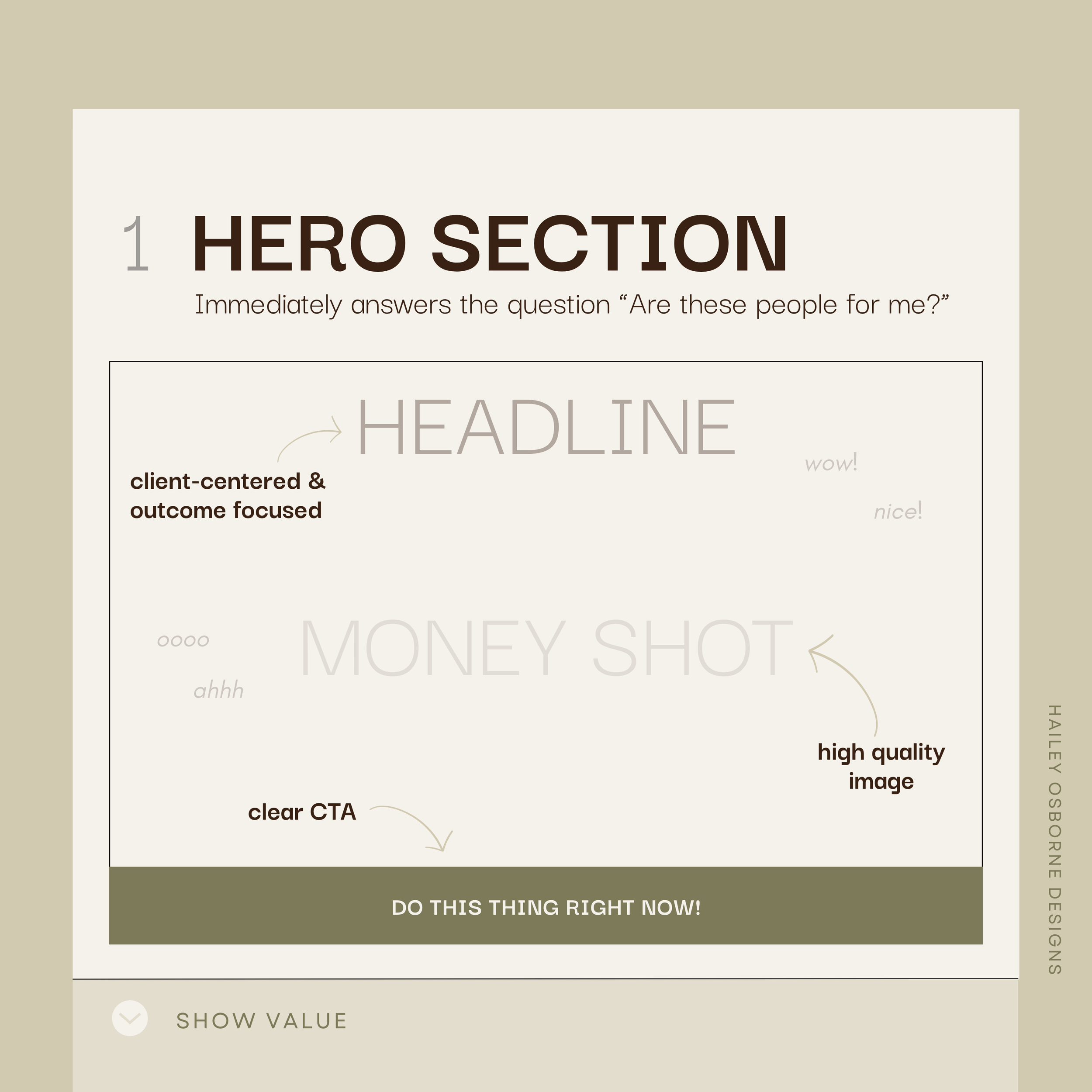
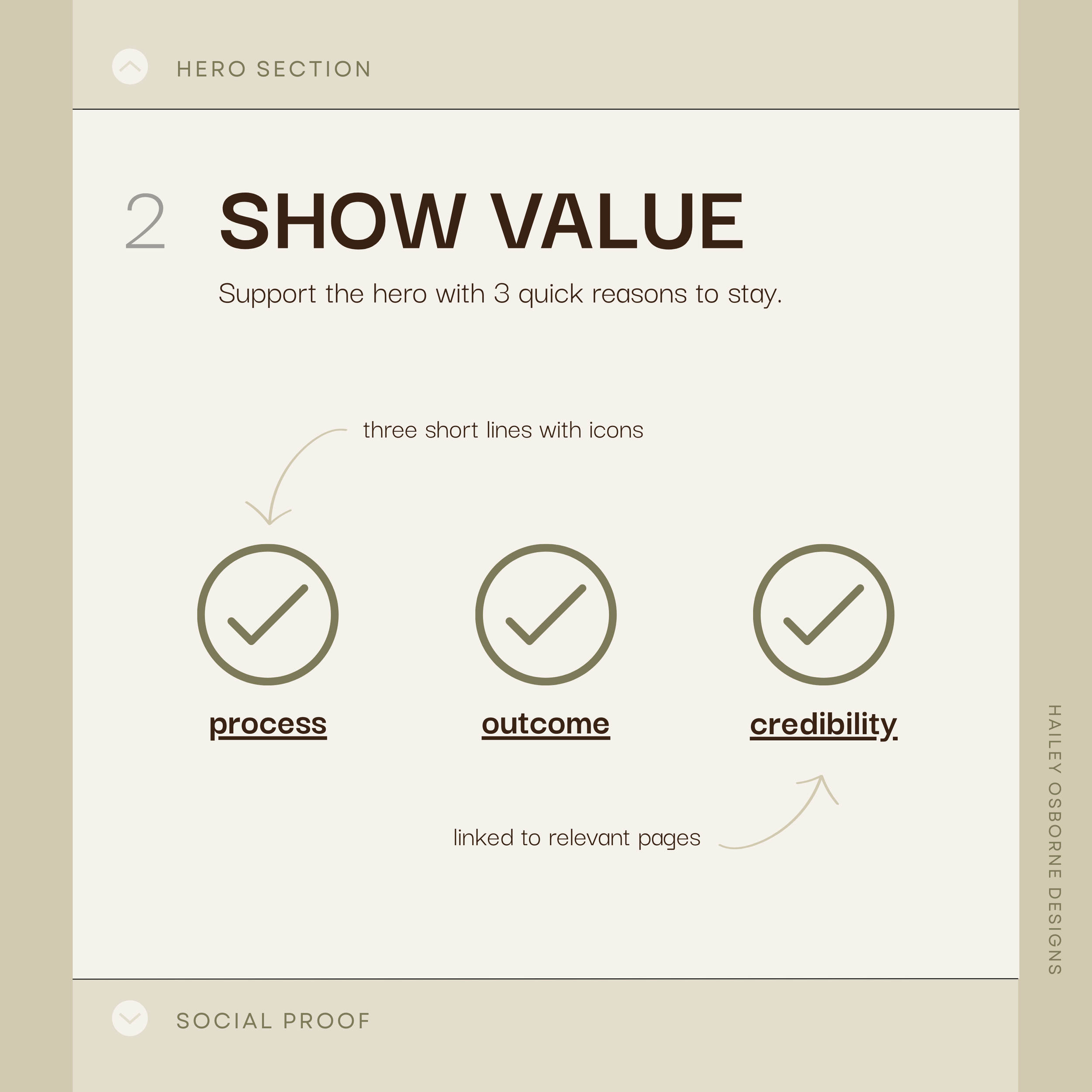
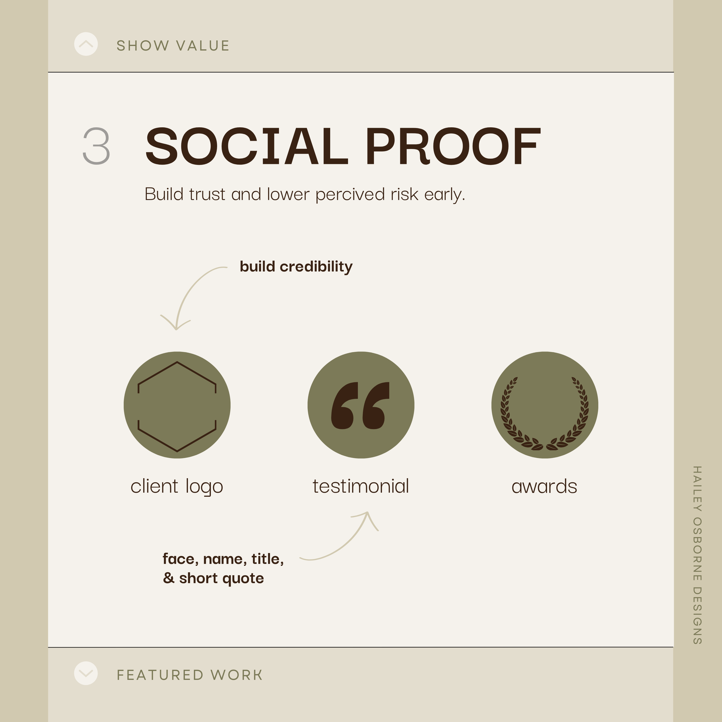
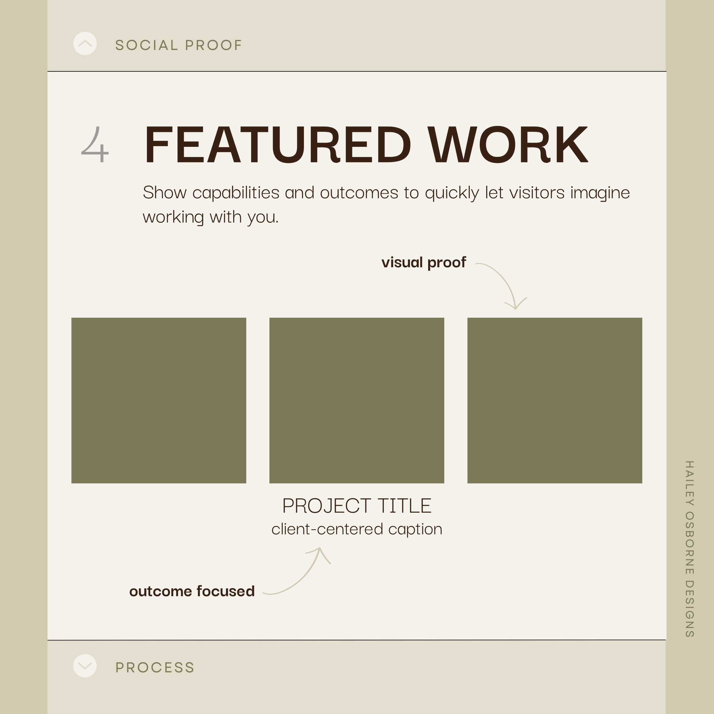
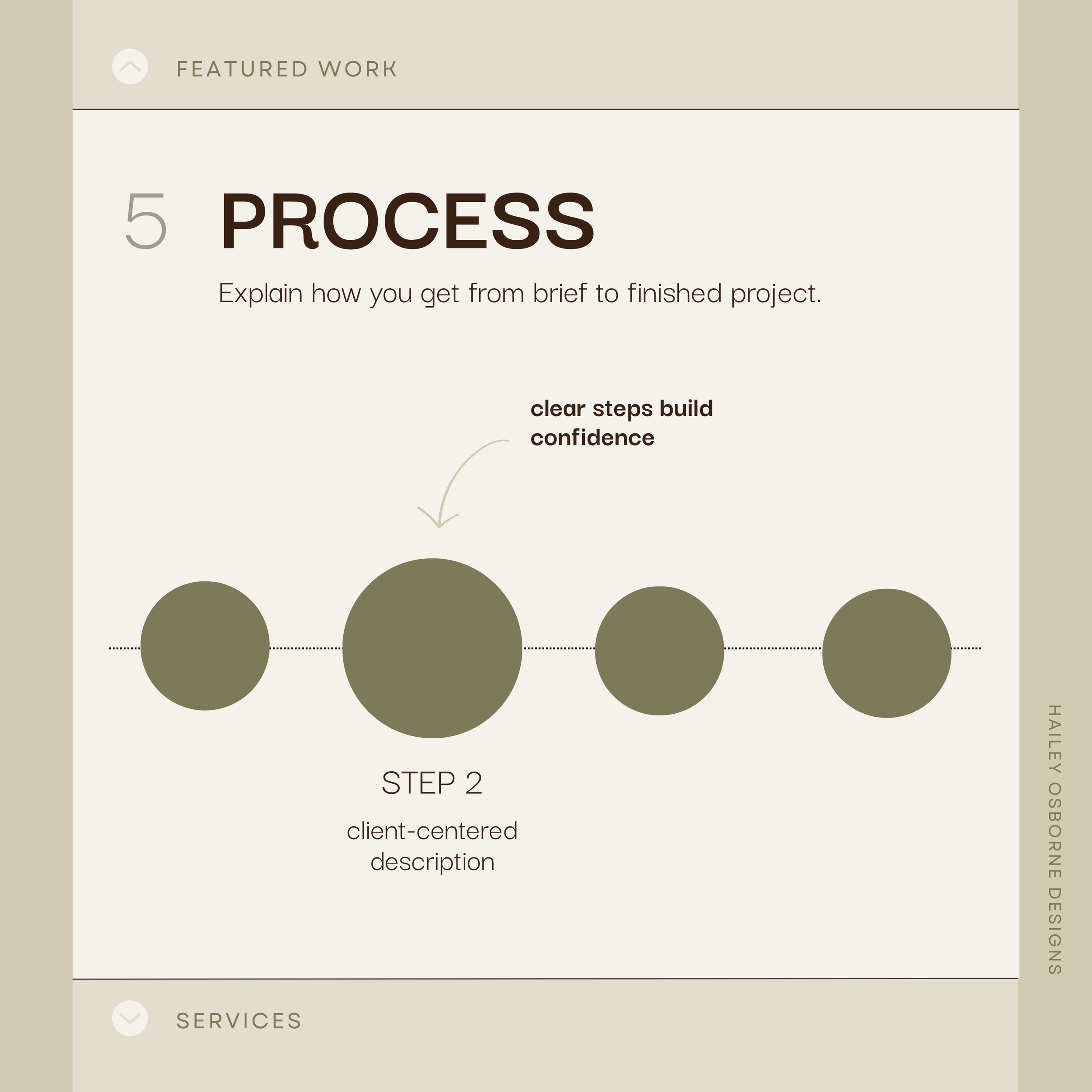
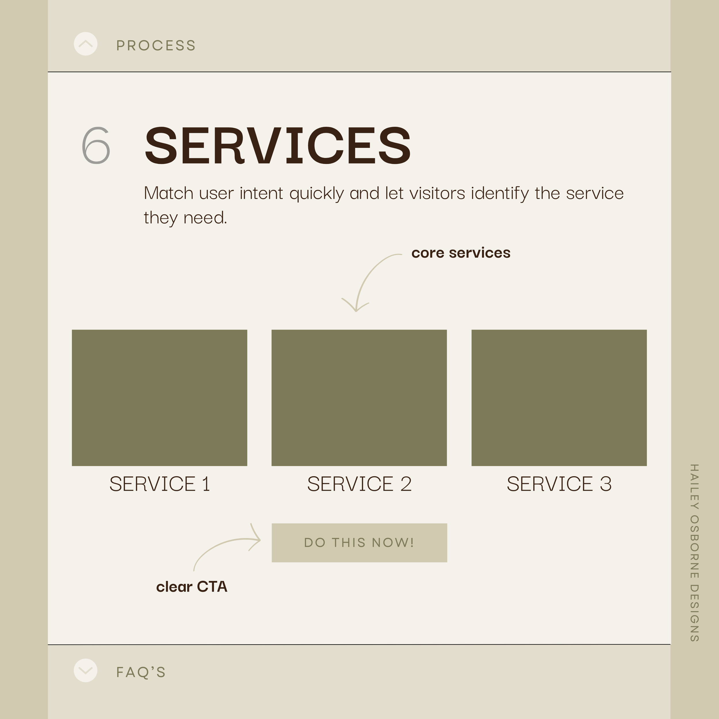
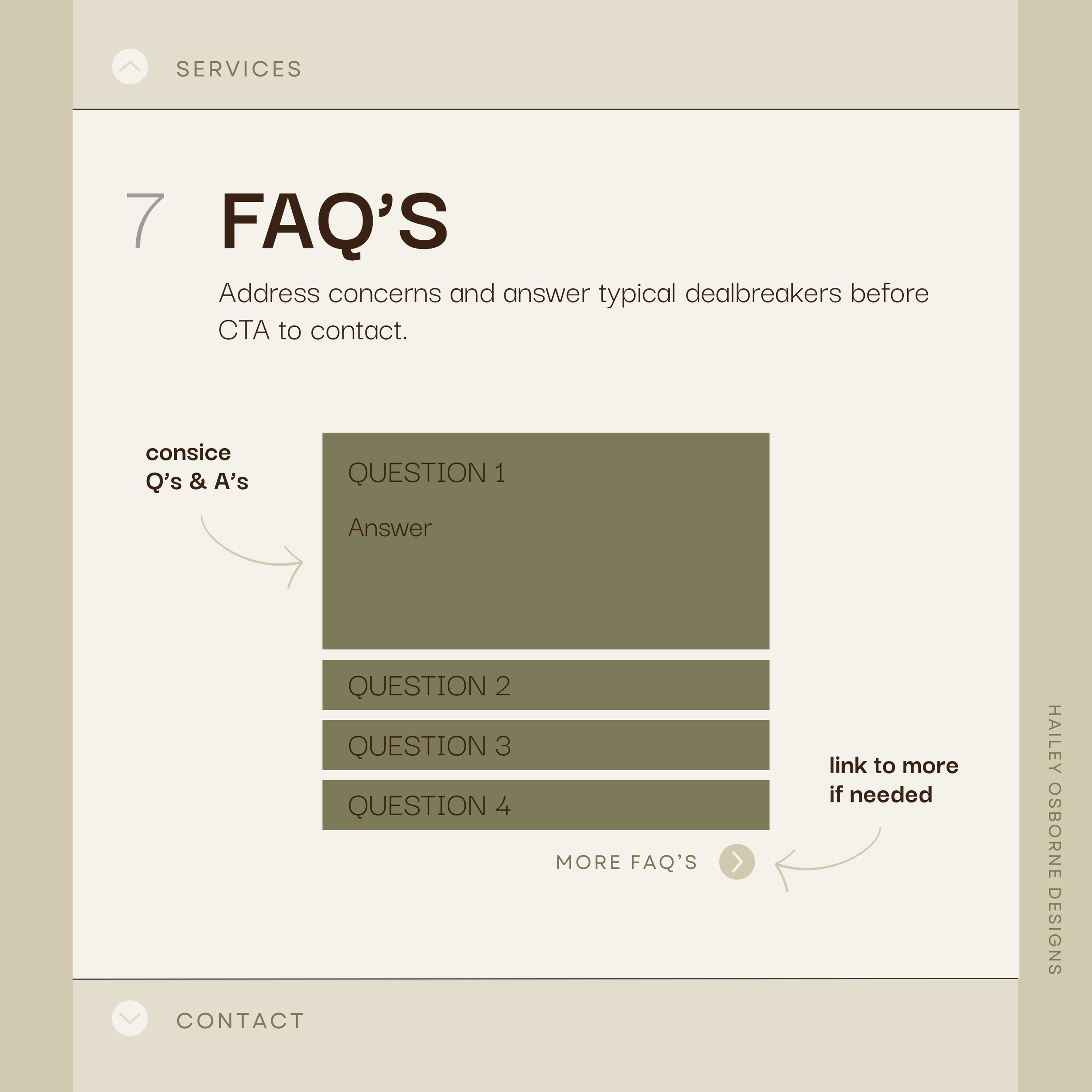
The homepage is the first page every visitor sees, making it the most critical part of your site’s flow. Think of it as the main lobby of your digital space: it should give users a clear summary of everything they can explore while offering planned routes to the sections that matter most. Headlines, visuals, calls to action, and navigation all work together to guide visitors intuitively from curiosity to engagement. A thoughtfully structured homepage ensures that users immediately understand who you are, what you offer, and how to take the next step, without feeling lost or overwhelmed. To illustrate this in action, check out my homepage blueprint carousel for design and construction professionals. It shows how visuals, messaging, and navigation can work together to turn visitors into clients.
Intuitive Design: Making the Path Obvious
Just like in architecture, intuitive design is what makes the path obvious:
Clear signage in a building = clear calls to action on a website
Logical spatial layout = predictable page hierarchy
Visual cues that guide you through a lobby = interface cues that guide users through to a contact form
A well-designed space shouldn’t leave you asking, “Where do I go now?”
An intuitively designed website shouldn’t make you question, “What do I do next?”
Flow and form aren’t in competition they support each other. Whether physical or digital, design succeeds when people can move naturally and intuitively through the space.